
How Can Data Exported from MaxQuant Be Used to Visualize Protein Mass Spectrometry Results?
MaxQuant is a widely used software for protein mass spectrometry data analysis, enabling the processing of liquid chromatography-tandem mass spectrometry (LC-MS/MS) data for protein identification and quantification. The data exported from MaxQuant typically include information on protein and peptide identifications as well as protein quantification. The following sections outline recommended strategies for visualizing protein mass spectrometry results using data obtained from MaxQuant:
Data Organization
Begin by organizing the exported data to extract essential information related to protein identification and quantification, such as protein IDs, descriptions, peptide counts, sequence coverage, and quantitative values. This step can be carried out using tools like Microsoft Excel, R, or Python.
Data Filtering and Normalization
Depending on the experimental objectives and data quality, apply filtering and normalization procedures. This may include removing proteins with low identification confidence, setting identification thresholds (e.g., based on false discovery rate, FDR), and normalizing quantitative values to ensure comparability across samples.
Data Visualization
Use appropriate visualization tools and software—such as Microsoft Excel, R, Python, or GraphPad Prism—to generate informative graphical representations of the processed protein data. Common types of visualizations include:
1. Heatmaps of Protein Expression
Used to display variations in protein expression levels across different samples. Colors typically indicate expression intensity (e.g., red for high expression and blue for low expression).
2. Scatter Plots and Volcano Plots
These plots illustrate both the magnitude and statistical significance of differential protein expression. The x-axis usually represents log-transformed fold changes, while the y-axis indicates significance levels (e.g., p-values or FDR).
3. Bar Plots and Box Plots
These charts are effective for comparing protein expression levels across multiple groups or samples, facilitating the analysis of expression patterns.
4. Functional Classification and Enrichment Analysis
Proteins can be classified based on functional annotations such as Gene Ontology (GO) or KEGG pathways. The distribution of functional categories may be visualized using bar charts or pie charts. Enrichment analysis can be conducted to assess overrepresentation in specific biological functions or pathways, with results visualized through bar plots, pie charts, or network diagrams.
5. Protein Interaction Network Analysis
Construct and visualize protein-protein interaction networks based on known or predicted interactions. In such networks, nodes represent proteins and edges denote interactions. Protein expression data (e.g., color, node size) can be overlaid to reflect expression differences among samples.
Result Interpretation and Discussion
Interpret the visualized data in the context of protein expression differences, functional classifications, and enrichment analyses. Discuss the potential roles of identified proteins in biological processes, molecular functions, and cellular components. These insights can guide further experiments and in-depth biological investigations.
Data exported from MaxQuant offer a robust foundation for visualizing protein mass spectrometry results. Effective use of visualization techniques enhances the interpretation of protein identification and quantification outcomes, as well as the exploration of protein function and interaction. Successful implementation requires proper data processing—organization, filtering, normalization—and interpretation tailored to specific experimental objectives and biological contexts.
MtoZ Biolabs, an integrated chromatography and mass spectrometry (MS) services provider.
Related Services
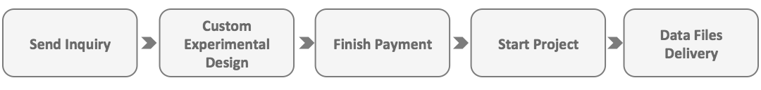
How to order?